
Seattle Credit Union: Rebrand
A complete identity overhaul for an established credit union. This included a subtle name change, color, type, and illustration palette as well as a new environmental branch design.


The original logo struggled to stand out in the ever-growing landscape of Seattle. Founded in 1933 as the original financial institution for city employees, Seattle Metropolitan Credit Union had grown to serve tens of thousands of Seattleites and was looking to expand their presence. While at Twenty Four 7 we did a brand audit surveying the credit union landscape and developed an in-depth strategy to move the bank into a new era.
Our strategy helped steer both the naming and the visual identity in a way that would focus on embracing Seattle.
We recommended shifting their name from “Seattle Metropolitan Credit Union” to simply “Seattle Credit Union.” This would more strongly cement themselves as “Seattle’s” Credit Union and would build better brand recognition, retention, and SEO.
With this insight in the forefront, we went into the design process starting with a wordmark that put “Seattle” front and center with “Credit Union” locked up as a supporting element. I searched through a variety of typefaces focusing on what felt most like Seattle while retaining legibility.


The design features an angled crossbar of the A at 33 degrees to signify upward growth and nod to the founding year of the credit union.
With the wordmark chosen, we dove into the rest of the brand development including an updated color palette, typography suite, and illustration style.

The color palette was driven by green, both for the Emerald Ccity and for banking. With plenty of green logos already inseen around Seattle, we made sure to research the entire landscape to find the right green hue SCU could command. The new primary green color was vibrant yet soft and we paired it with a brighter, more electric green color that brought energy to the brand. The cooler off white and dark gray were clean and contemporary compleiments to the greens.
The secondary color palette acted more as a support tool for the illustration style. Bringing in yellows and blues that paired well with the primary palette allowed for more robust scenes and pieces to be created. In 2020, we extended the secondary palette to include orange, red, and purple for use in DEI initiatives giving SCU an entire spectrum of colors to work with.


The illustration style and color palette came together in this brand launch video.
For typography we chose a font palette that’s bold, flexible, and personal. This palette was also chosen to lead a type heavy identity.
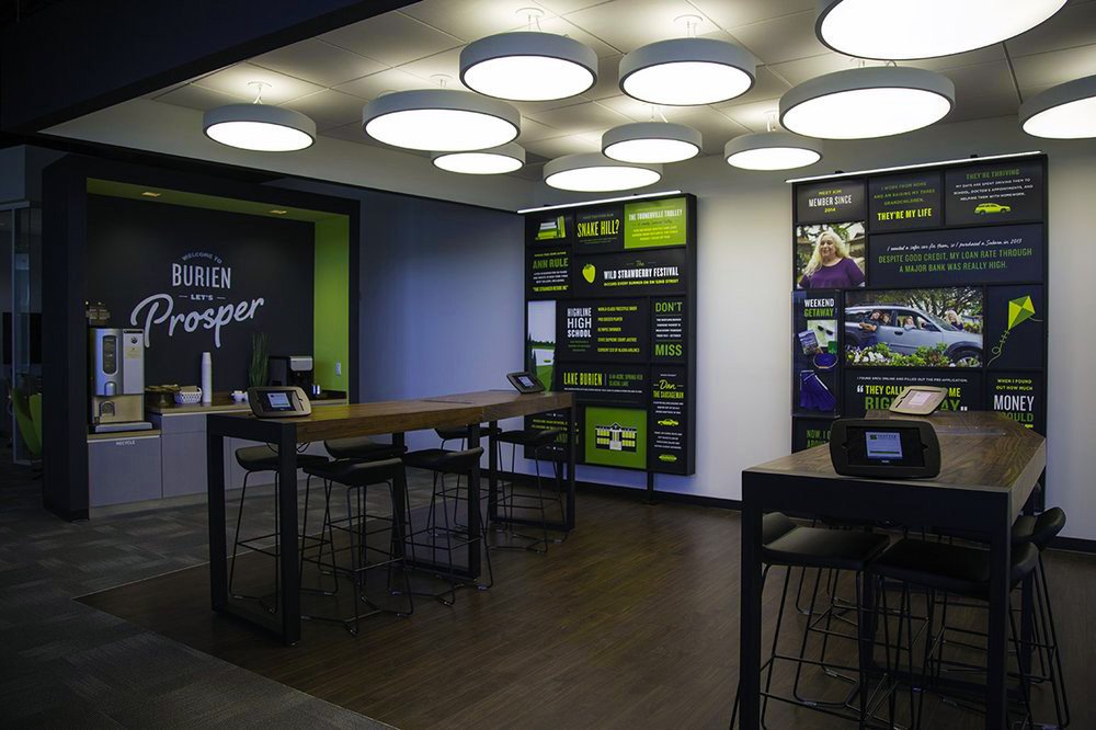
The typography package consisting of Knockout, Gotham, and Felt That, is best showcased by a set of in-branch graphic walls that displayed various localized topics including financial tip and tricks, member profiles, and neighborhood stories.


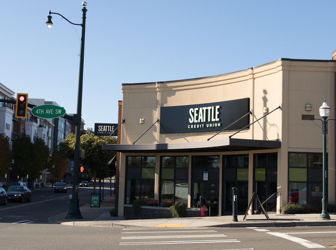
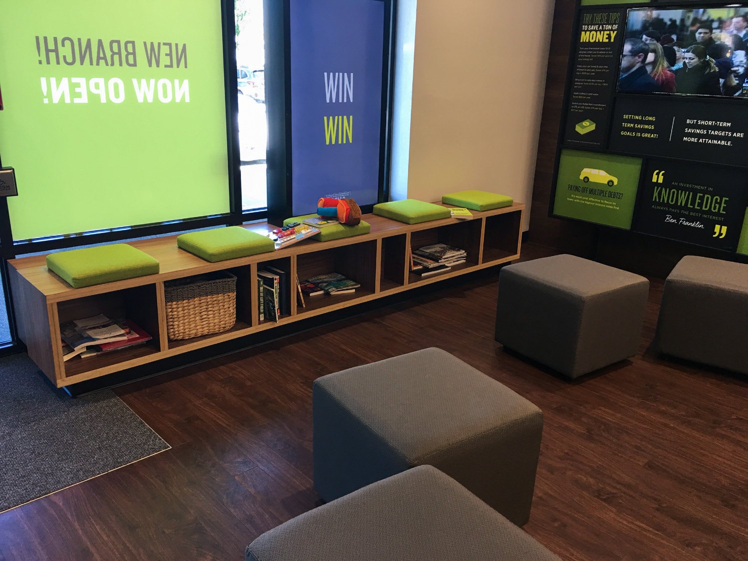
The updated identity was applied to all seven bank branches across the Seattle metro area.
This included exterior and interior signage, ATM wraps, branch videos promoting products, and various printed handouts. The iIdentity was also applied to the credit union’s website and social media accounts. Overall The illustration style and broad typography palette allowed us to create plenty of assets quickly and budget friendly for SCU to use across lots of different channels from bank statements to billboards.


I learned so much during the design process and had to obsess the details throughout, ensuring the brand would maintain its look over time. I’m quite proud of how everything came together and seeing it continues to evolve overtime has proven the hard work paid off.
-
Logo Design, Brand Book Design, Color Palette, Typography Suite, Illustration Style, Iconography, Visual Center, and Production Graphics.
-
Late 2017 With Twenty Four 7
-
Mimi Lettunich: Executive Creative Director
Jeff Pigeon: Design Director