
Widmer Brothers: Oktofest Event
An updated brand identity and graphic language buildout for Portland’s longest running Oktoberfest. This included designing social & marketing materials as well as all the event signage.

This was Widmer Brothers’ 19th annual Oktoberfest and their main goal was to expand the size and visibility of the event.
The Moda Center courtyard allowed us to almost double the capacity with the added bonus of accessibility and recognition compared to past events held at the Widmer Brothers Brewery.
In addition to a new location for the event we also tweaked the name of the event to simply “Oktofest” inspired by the ‘Okto Festival Ale’ that Widmer Brothers brews each year. This also helped differentiate the event from many other Portland Oktoberfests happening in the city.

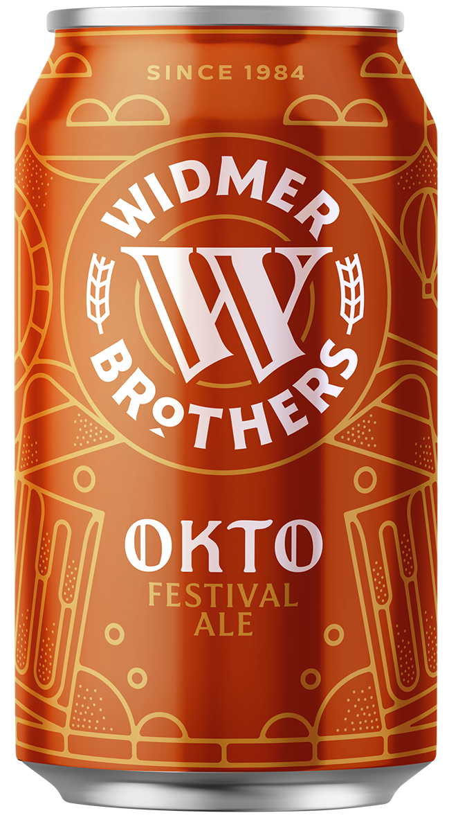

The blocky bold type, accented ‘O’, and warm color palette helped us achieve something that had a nod to the German festival while also being uniquely Widmer Brothers.
The color palette was developed with the iconic Hefe yellow in mind. This distinct brand color needed to be integrated without competing with any other Widmer brand elements. A burnt orange and deep red, inspired by a Portland summer sunset, fit seamlessly allowing the Hefe yellow to be the supportive bright accent color while the burnt orange defined the brand.

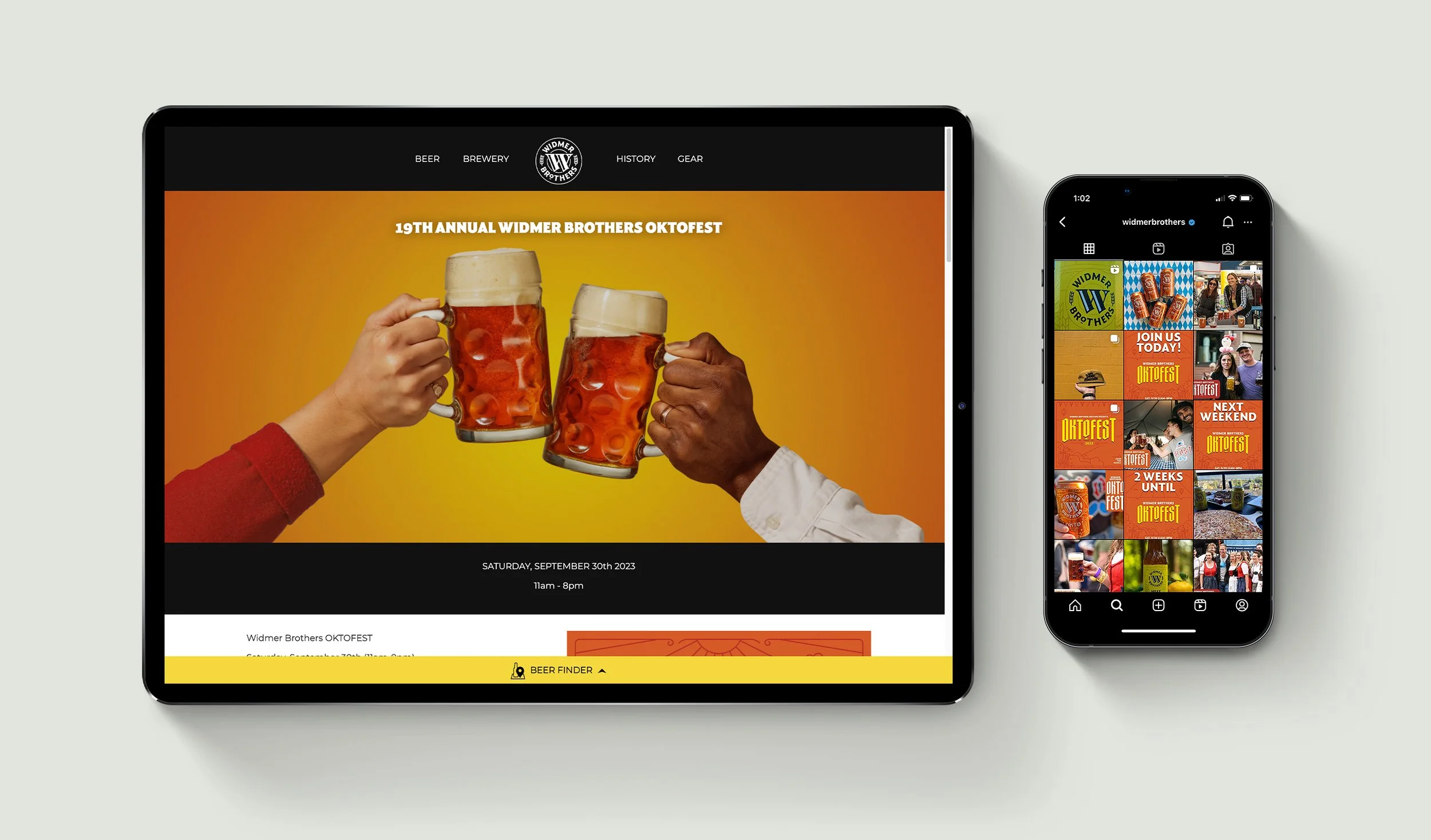
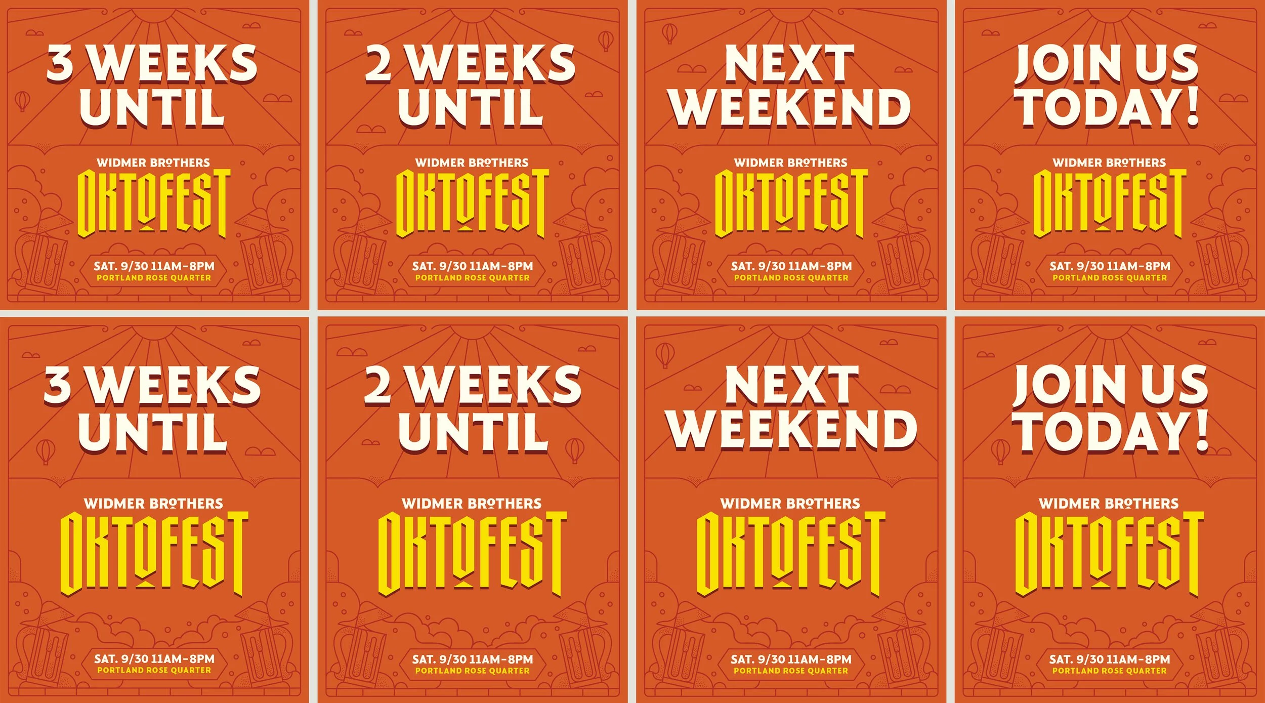
A variety of assets were created to advertise the event including billboards, web banners, and social media posts.
Each piece required tweaking the background illustration which was pulled from the existing ‘Okto’ can artwork and expanded to fit all of the size variations in content creation.

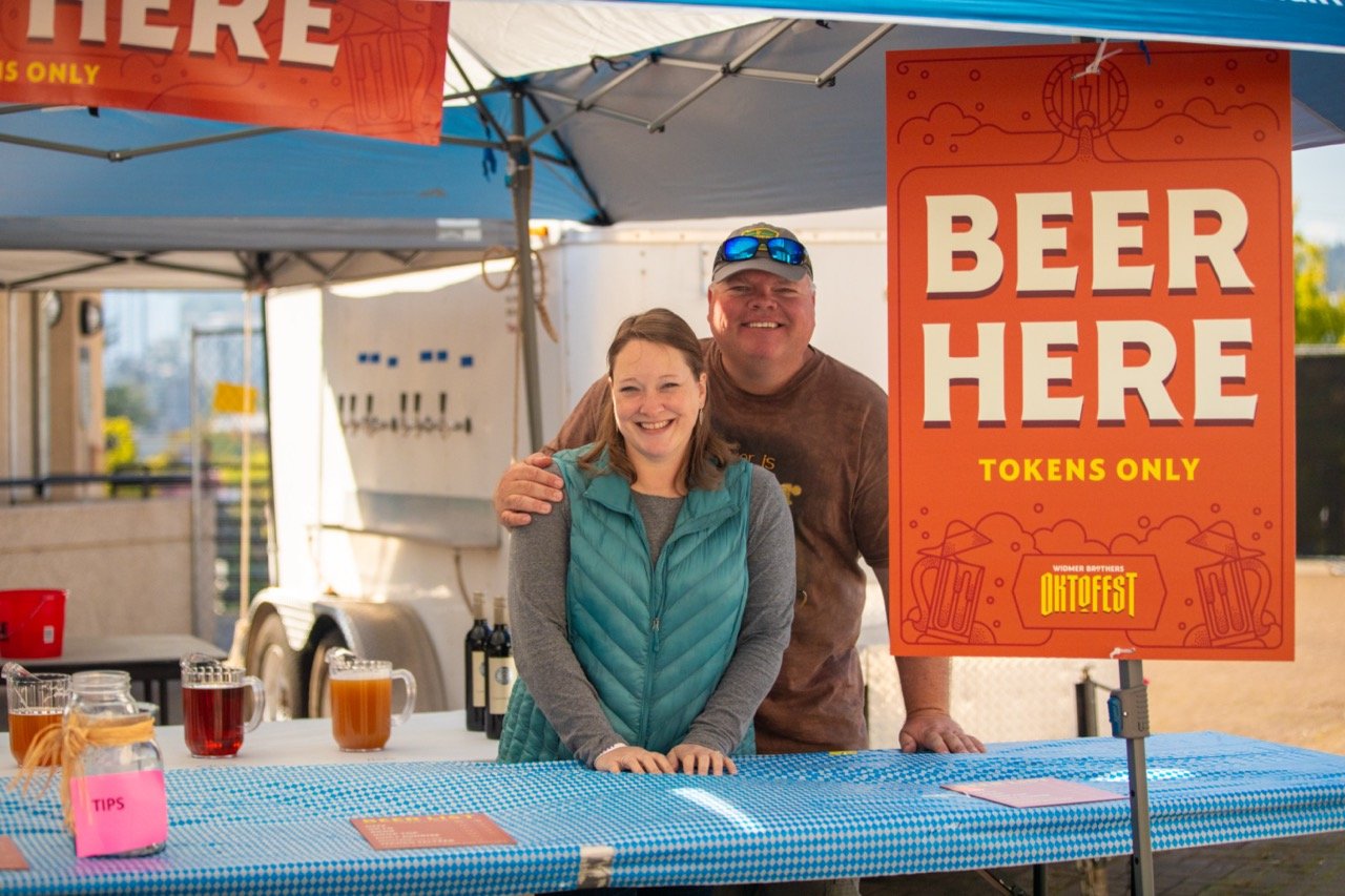
I designed all of the signage for the event which included way finding, flags, banners, tent headers, fountain wraps, beer menus, and handouts.
Similar to the marketing pieces, I individually adjusted the layout and background illustration of each element taking into account the final print size to try and match the stroke width across graphics. I also took part in walkthroughs prior to the event with both the print vendor and client helping answer design questions and filling any graphic gaps.
In addition to designing each piece, I also helped in the final production of assets ensuring print colors, bleed, and all final details were accounted for. In total roughly 40 unique print graphics were created for the event.

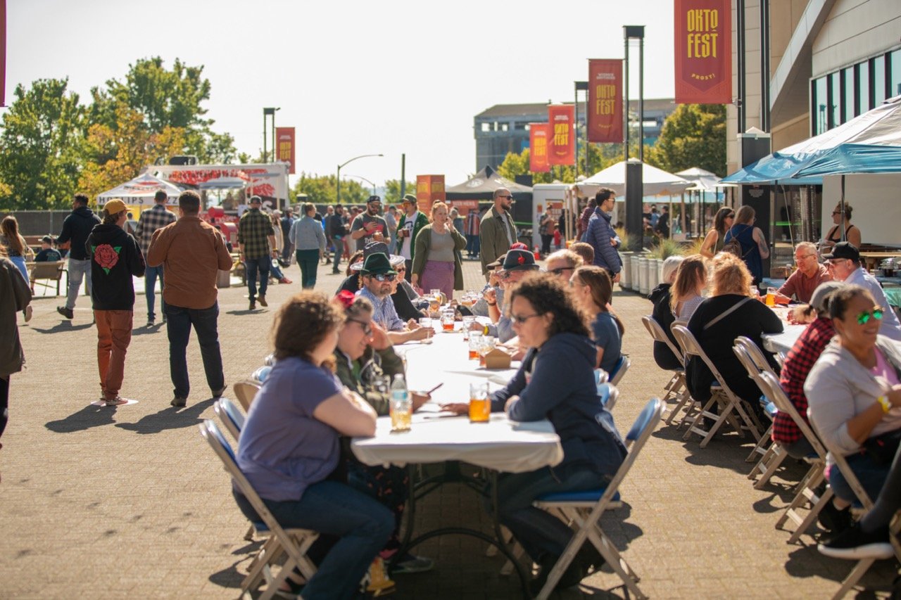
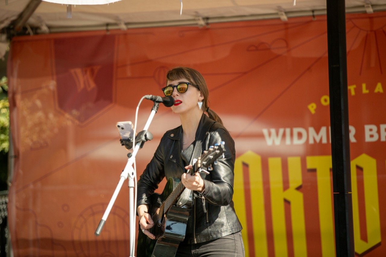
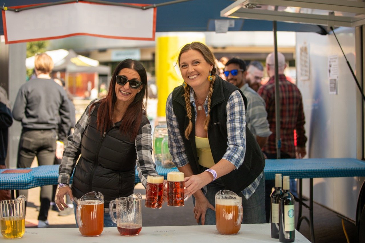
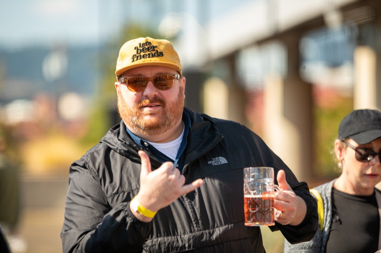
The day of the event was beautiful, the sun was out all day and plenty of Portlanders showed up!
All of the graphics were in place and looked great in person. Throughout the day a steady crowd of people hung out, drank beer and enjoyed the event festivities. This included a few local bands, local food carts, photo ops, a balloon artist, and plenty of beer.


Creating so many assets made for a lot of great learnings plus seeing it all the way from concept to production was fulfilling. I’m excited to see how the Oktofest brand continues to move on in the future events to come.
-
Art Direction, Logo Design, Brand Development, Marketing and Print Collateral, Print Production.
-
Mid 2023, with Plastic Sunshine
-
Louis Carlton:
Executive Creative Director