
Netflix: Sports Brand System
A new brand system created specifically for sports content on Netflix. This included a robust set of guidelines and examples for Netflix to use for content creation and marketing materials.
Netflix had recently launched sports content on their platform and were looking for ways to differentiate it from the material they’re known for.
This new set of content like ‘Formula 1: Drive to Survive” and the “Untold” docu series had a high level of story telling and emotion that focused more on the athletes than the sport they’re known for playing.
The project began with developing a tone of voice and brand manifesto to help guide us in the creative process. We landed on the phrase “Stories Deeper than Sport” which spoke to the emotion and intensity of the shows Netflix was launching.

We knew we wanted to match the energy and drama of the sports action and I found a simple and flexible solution that became the core concept of the visual system.
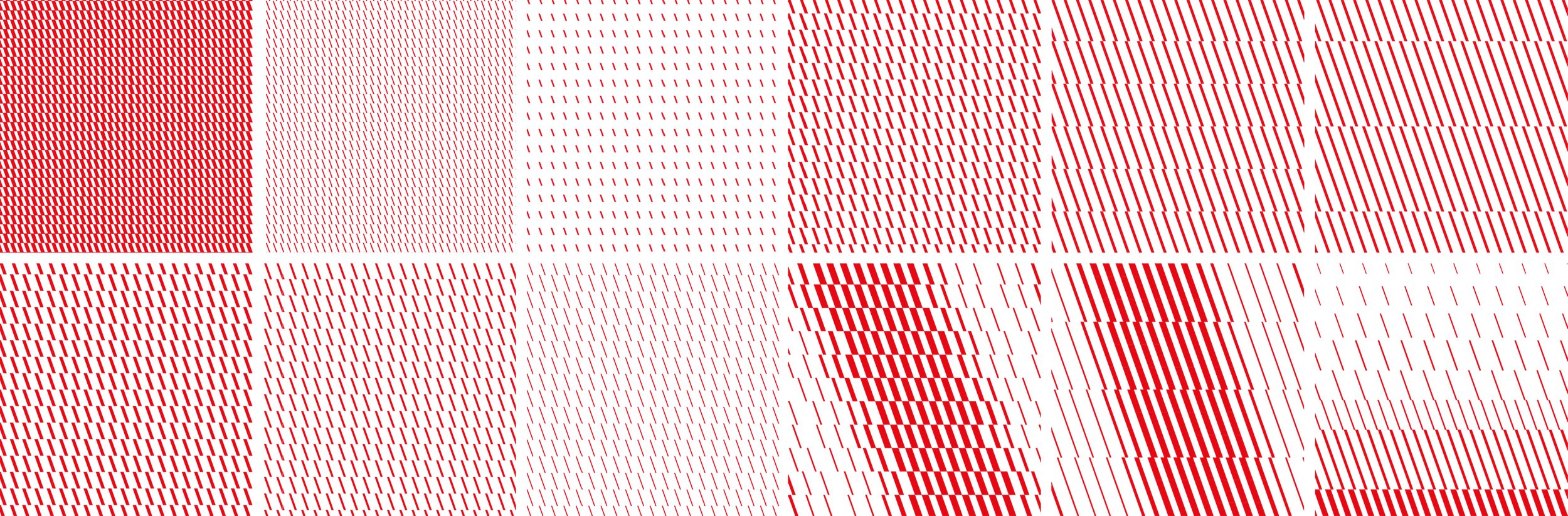
By focusing on the angled stroke of the Netflix ‘N’ symbol we pulled out that shape and the 19.5° angle and leveraged it throughout the design.
The shape had the flexibility to be stretched and scaled, or retained its shape, to be used as a framing element, graphic treatment, graphic texture and patterning. This angled concept brought a sense of speed and agility to all applications, something that the current brand standards lacked.
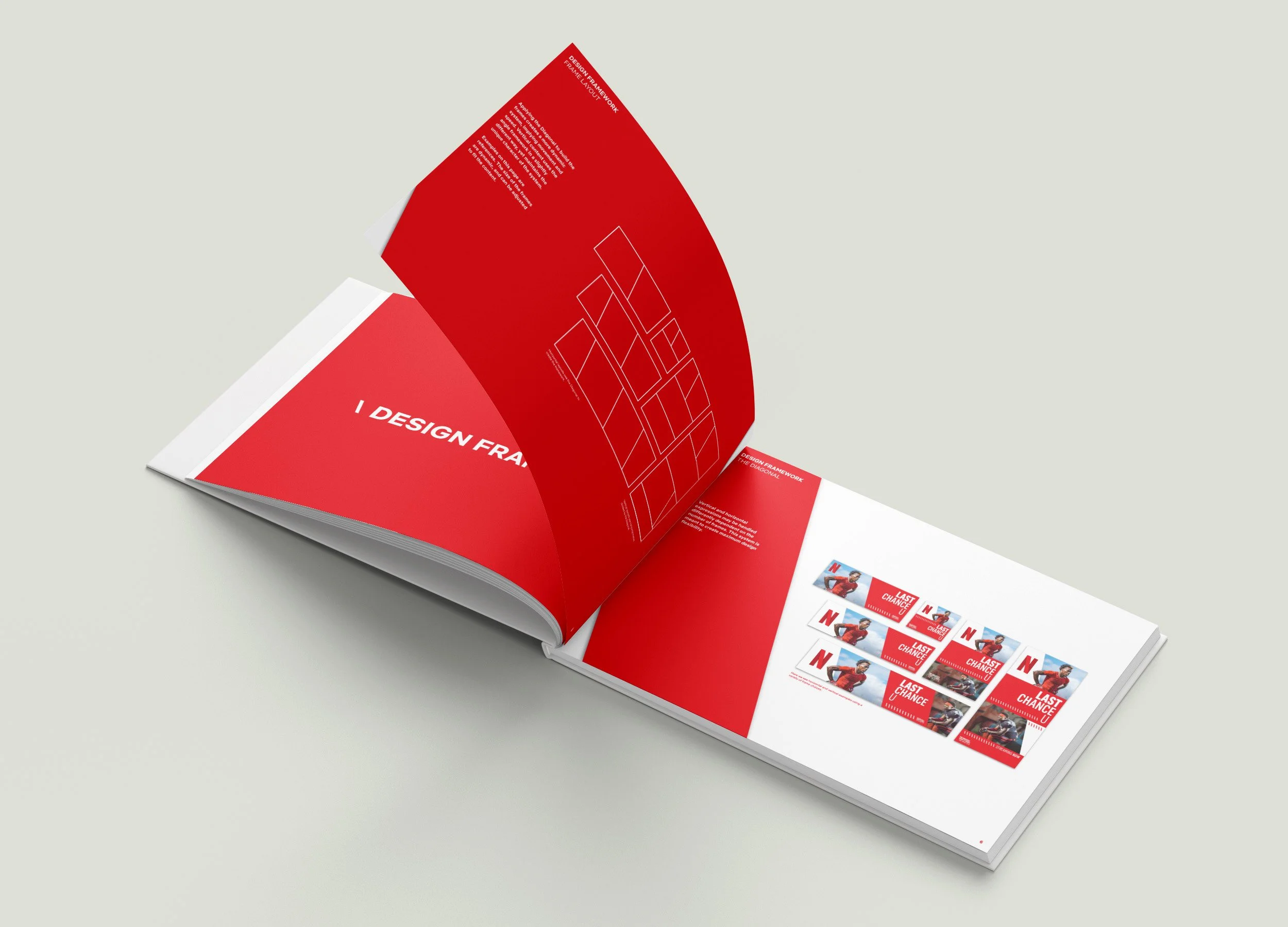

The project deliverable was a robust set of guidelines that explained all of the parts and pieces of the visual system and how to use them.
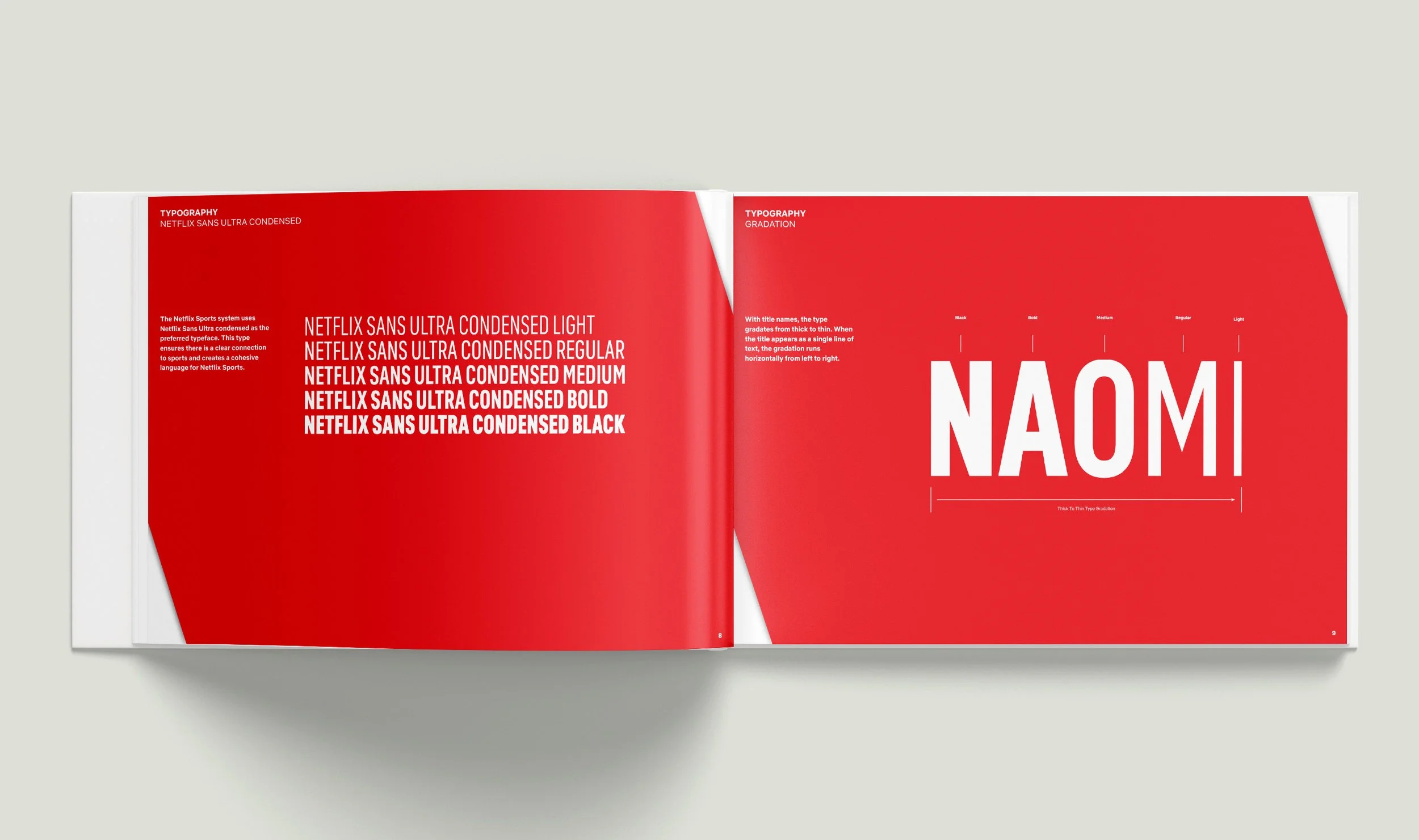
This included a unique typographic treatment that mimicked the angularity of the N shape, a layout guide for all types of sizes and ratios, and a scalable color system. The type treatment leveraged the robust set of ‘Netflix Sans’ in a gradation of weights from bold to light to match the energy of the other graphic elements.
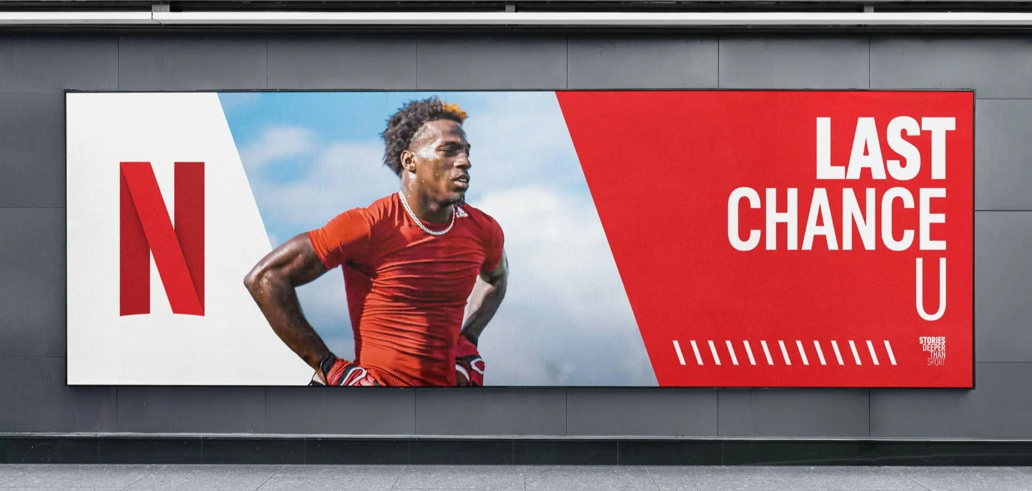
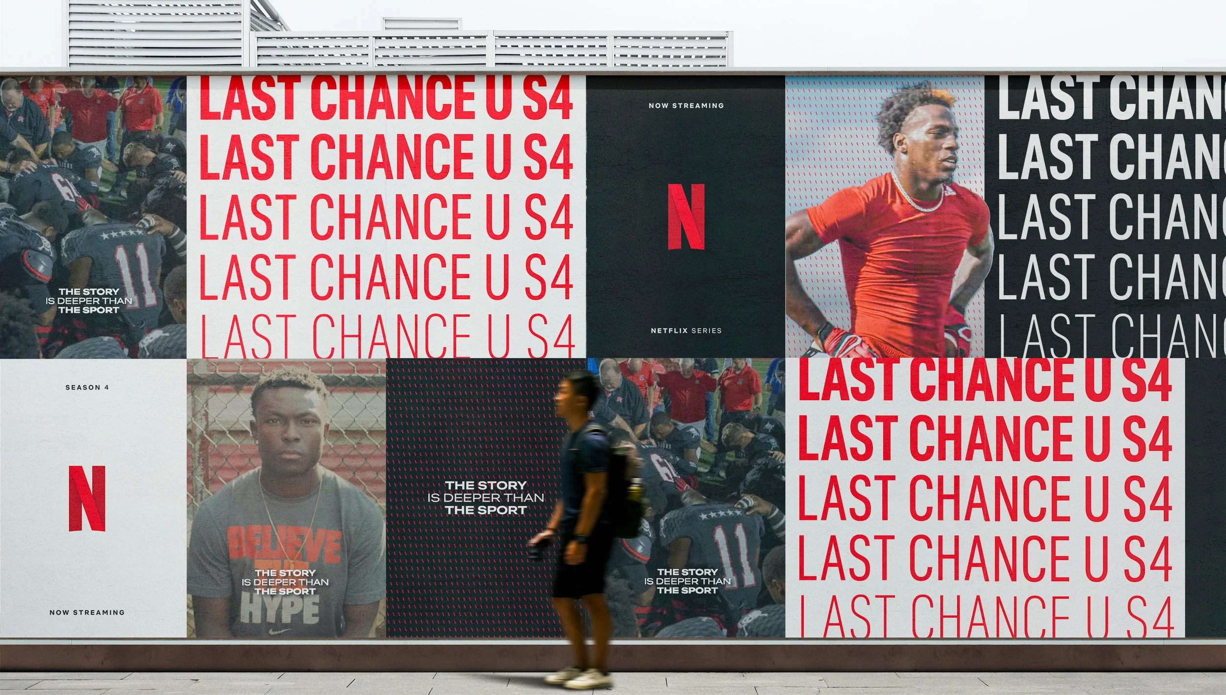
The system comes together above with multiple elements of the angled N present. Here we see the framing element used to separate the layout into sections, the type treatment, and the graphic texture drawing the eye to the hero statement and sign off. This cadence was used throughout the system across different layout types, sizes, and titles.
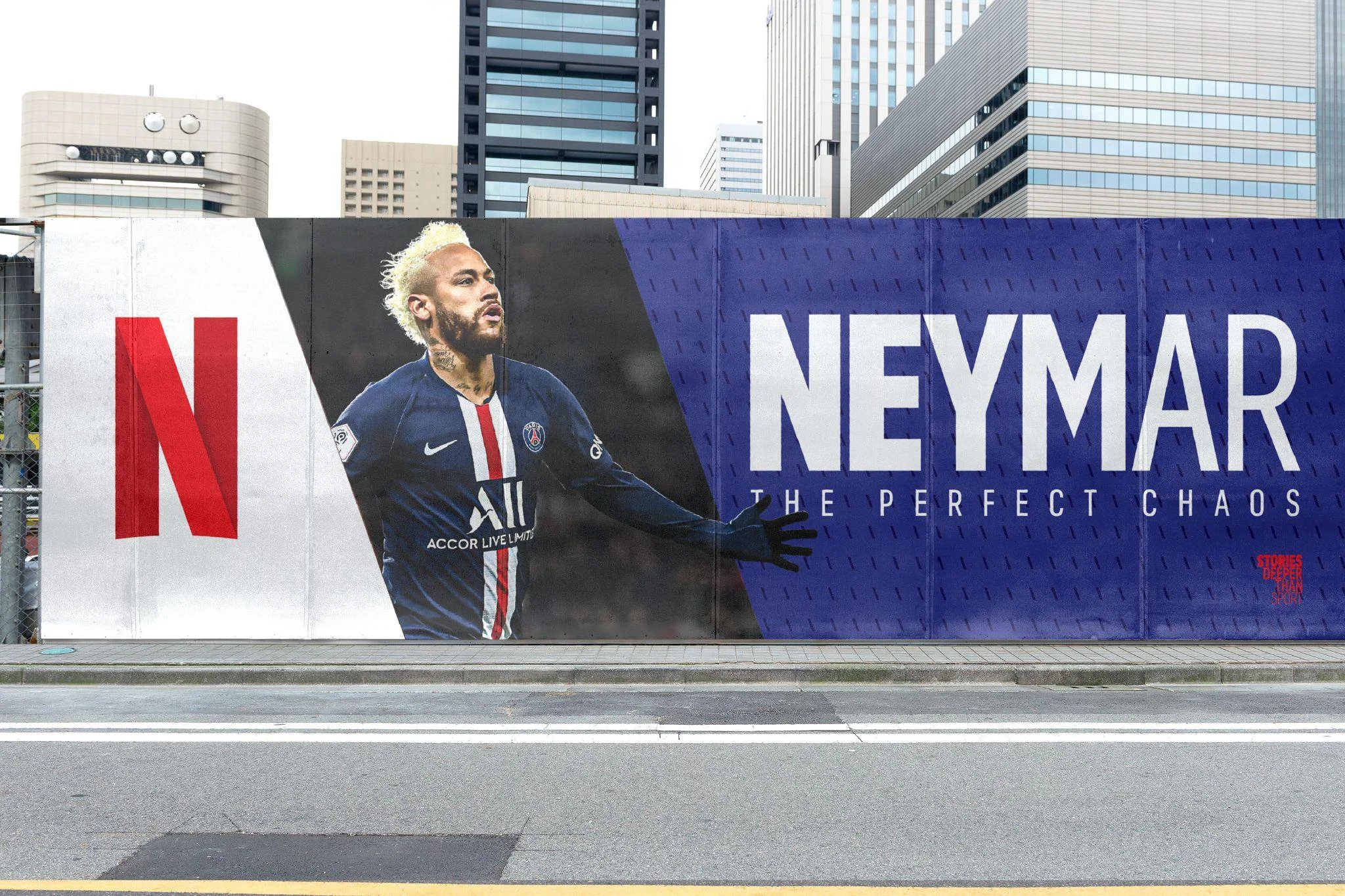


In building out each example, we let the Netflix title and athletes be the hero. The athlete images expanded outside of the framing element to add emphasis, colors were pulled from the images help set the tone, and the patterns and graphic elements were tweaked to match the energy of each title.


The system was best showcased in a television spot that ran during the opening night of the NBA season.
The ad showcased the energy and flexibility that the system was built for, showing off the up and coming sports content with intensity and intrigue. Seeing the Netflix team utilize our brand system to create a full TV spot that applied all of the elements we created gave us confidence that the system would continue to thrive as Netflix expanded into the sports sector.
This project was a true testament to what can be achieved with a small dedicated team in a tight timeline. I learned a ton throughout the process and to see almost immediate success with the TV spot was encouraging and inspiring.
-
Layout Design, Design Development, Concepting, Mockups, Brand Book Design
-
late 2022, with Plastic Sunshine
-
Louis Carlton: Creative Director
Dan Garland: Designer, Illustrator