
Trail Blazers: Rip City Font
A custom display typeface designed for the Portland Trail Blazers based on the iconic ripcity logomark.

Before this project, the ripcity logomark was a stand-alone piece and had no other letterforms in existence.
During my internship with the Trail Blazers, I was tasked with creating a new in-arena graphic that utilized the ripcity logomark and combined it with Oregon. This was part of an overall marketing initiative that united the fan base under the ripcity brand to reach beyond Portland and position the Trail Blazers as Oregon’s team. We decided the best direction was to create a new lockup that read “ripcity,oregon” in the same font style as the ripcity logomark.

With the creation of four new letterforms, I thought, what would it take to build an entire font?
I had recently completed a typography design class at Portland State University and learned the ins and outs required to create a working, typeable font. Therefore, I felt confident I could build a full lowercase typeface entirely based off of the ripcity logo. I then successfully pitched the idea.
Each letterform emulated the ripcity logo with bold weights, sharp ascenders and descenders, and very low contrast.
Slowly but surely, I worked out iterations of each letter reviewing often with the design director ensuring each one felt on brand and in line with the others.
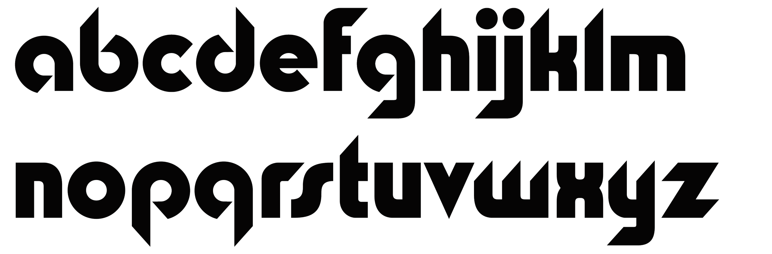
Once the main alphabet was completed ahead of schedule I moved onto the special characters, numbers, and punctuation. The number suite was especially tricky since it broke a lot of rules I’d established in the alphabet. Other characters like the #, @, & were more fun and allowed for additional design personality.
Lastly, I added basic language support allowing for correct name spellings of unique player names, like Jusuf Nurkić, Skal Labissière, and Rudy Fernández. This also made the font more inclusive allowing for commonly used foreign words to be used with their correct accents.

What really made the font work was the kerning. I spent hours ensuring each character looked great next to it’s counterpart without odd squeezes or gaps.


-
![]()
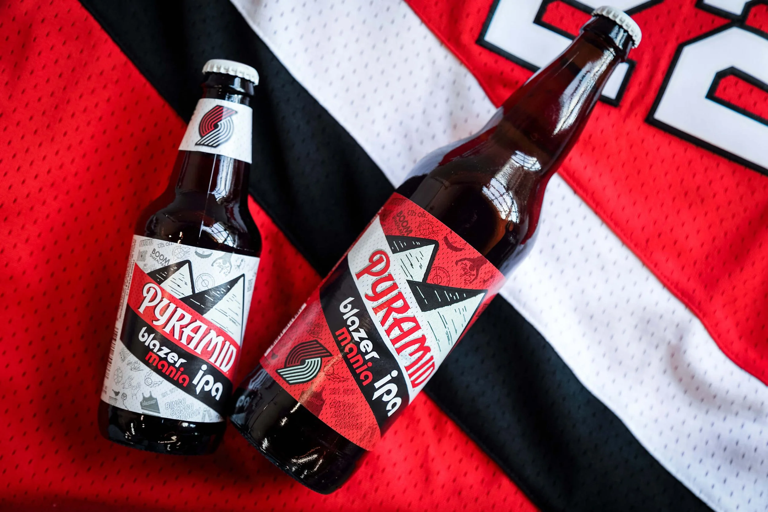
Blazer Mania IPA
A couple years after the Schonz Ale, Pyramid Brewing used the font again for the Blazer Mania IPA.
-
![]()
50 Year Anniversary
Used for the Trail Blazers’ 50 year anniversary campaign in various applications including the court.
-
![]()
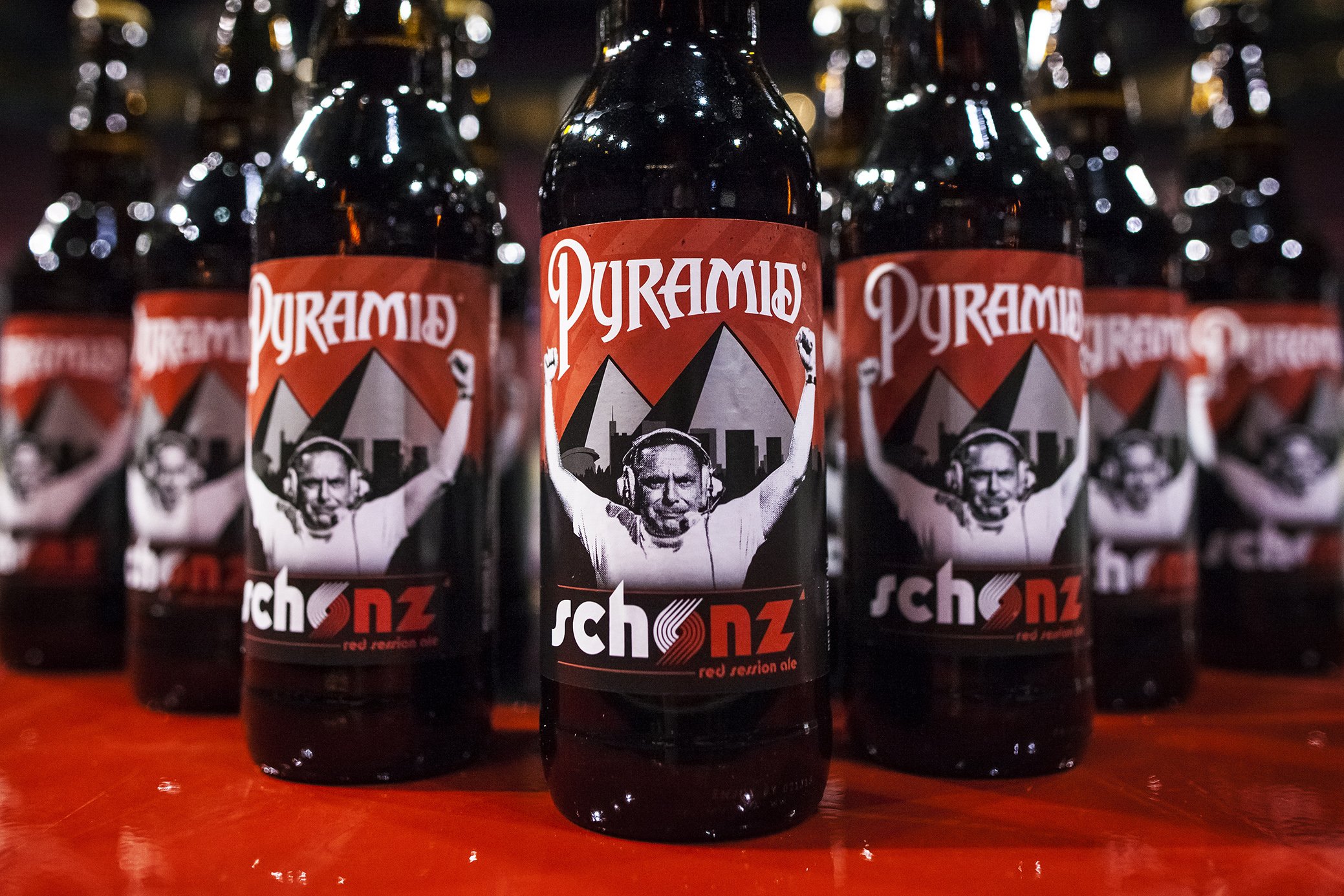
Schonz Red Session Ale
Pyramid Brewing used the font for both the largely distributed Schonz Red Session Ale across the Portland market.
-
![]()
Vote 2020
Used as part of the “Vote 2020” campaign encouraging the community to register and vote.
-
![]()
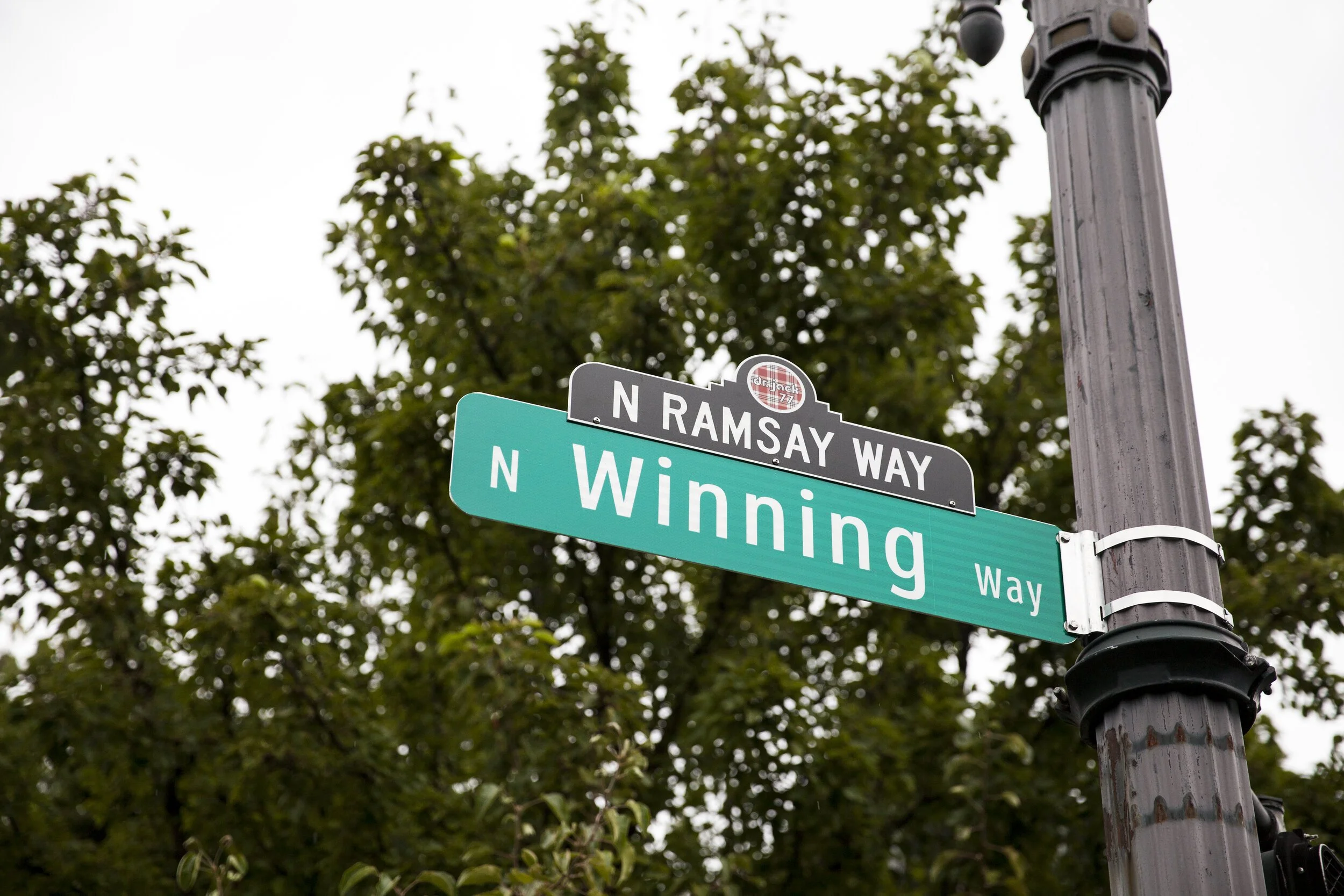
Remembering Dr. Jack
Used in the ‘Dr. Jack 77’ ceremonial patch worn on Trail Blazer jerseys and on the street sign for North Ramsay Way at the Rose Quarter.
-
![]()
Playoff Placards
Used as a hero element of the 2014 NBA Playoffs look and feel with placards, giveaways, and in arena graphics
-
![]()
2014-15 Team Yearbook
The font is well represented in a freelance project I did for the Trail Blazers post internship.


I was really grateful that the Trail Blazers team gave me the space and capacity to take this project on and I’m over joyed to see it still in use years later.
-
Typography Design
-
Mid 2014 with the Trail Blazers
-
Mario Milosevic: Design Director