
Brews & Birdies: Identity
Creating a new visual identity for a local golf event that raises money for kids.
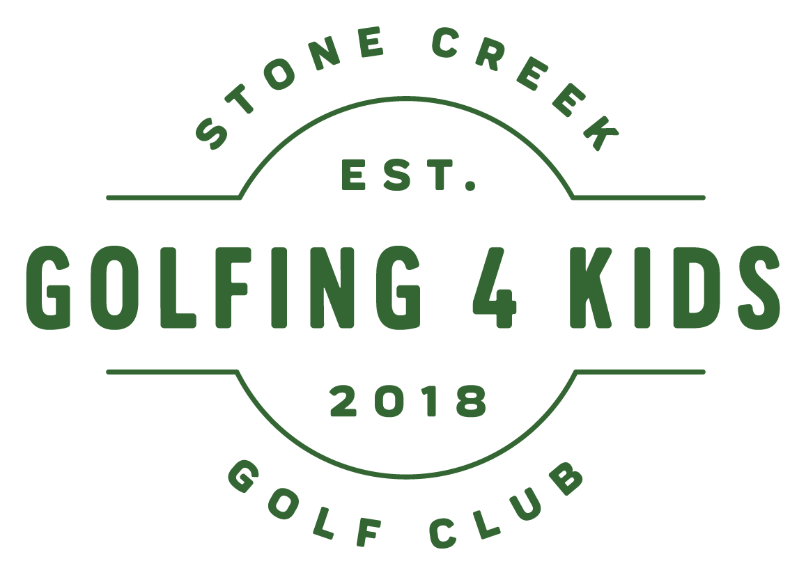
Taking place yearly at the Stone Creek Golf Club in Oregon City.

The goal for the brand was to showcase the event and location while having a slight nod to iconic sticker like beer labels.
I developed this brand in coordination with the events founder. After looking at various beer labels for inspiration, I felt that a circle or badge based logo mark would work best. It also conveys the shape of a golf ball while allowing for space to create a visual scene.
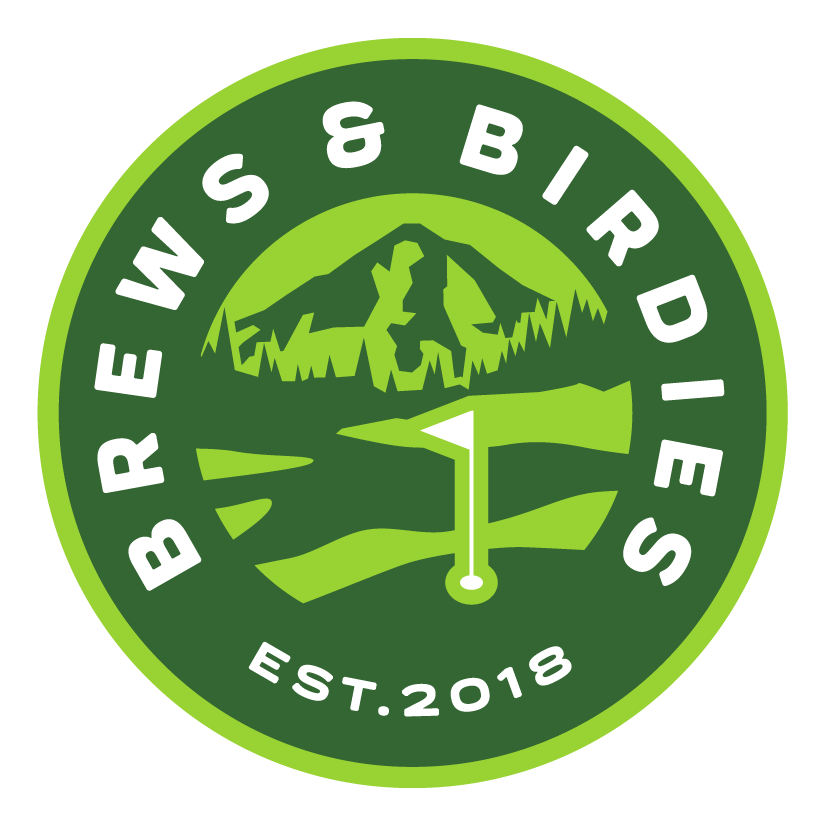
The primary mark features the name, prominently and legibly, and displays an abstract view of the course at Stone Creek Golf Club. One of the holes at the course faces Mt. Hood, which is an easily identifiable icon of the Portland metro area and cements the brand as a local cause.
I chose a deeper green as the main color to identify with Oregon forests and the rough grass synonyms for golf courses paired with a brighter green to highlight and add energy to the brand.
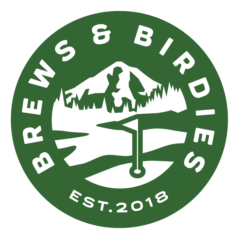
The identity was expanded to include a secondary and tertiary mark to allow for more variance in marketing materials and giveaways.


A few mockups help showcase how the brand comes together, and illustrate how the colors and logos can be applied to merch and marketing materials.


As a final handoff I supplied the organizer with a brief brand style guide and a full set of assets for print and digital in various sizes and file formats.

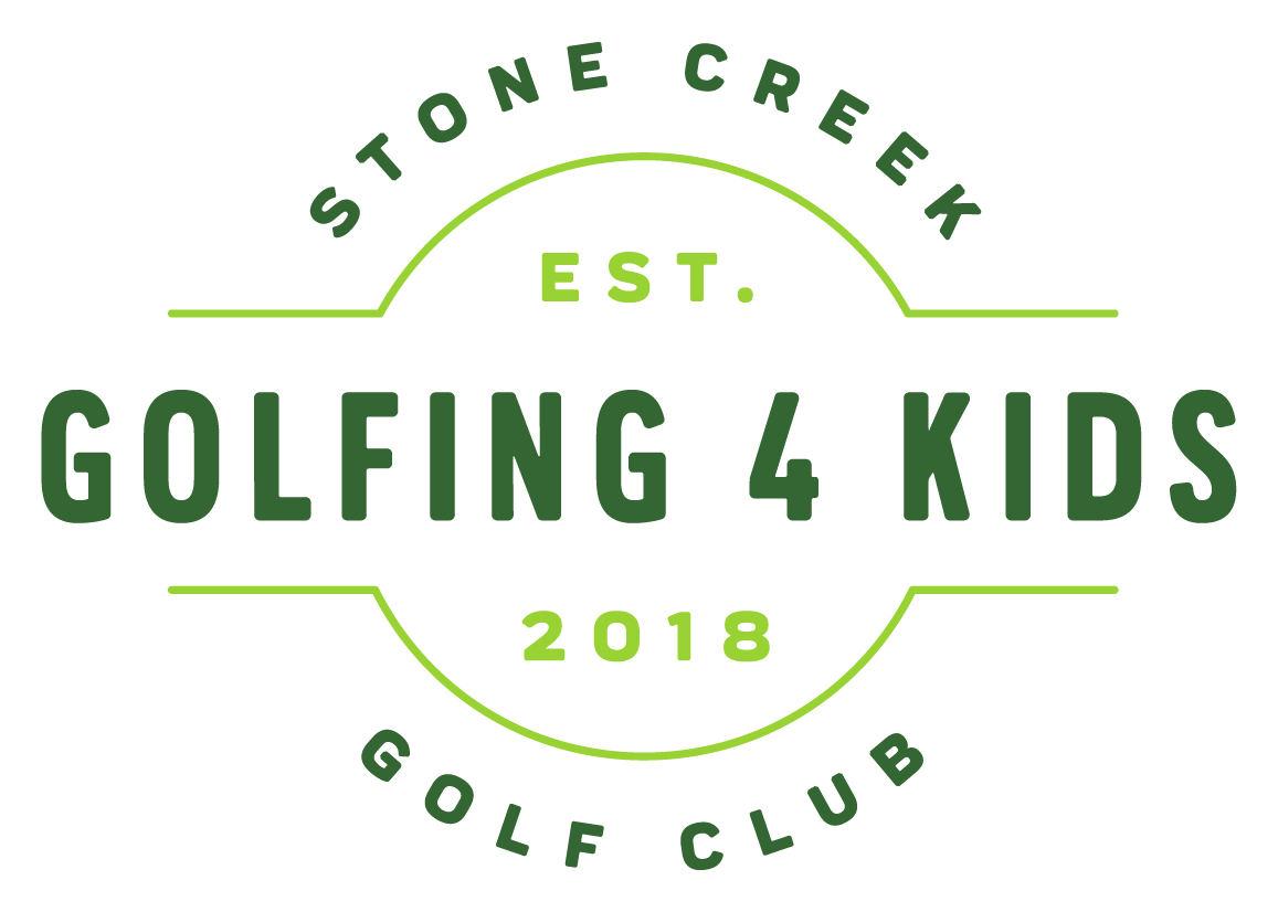
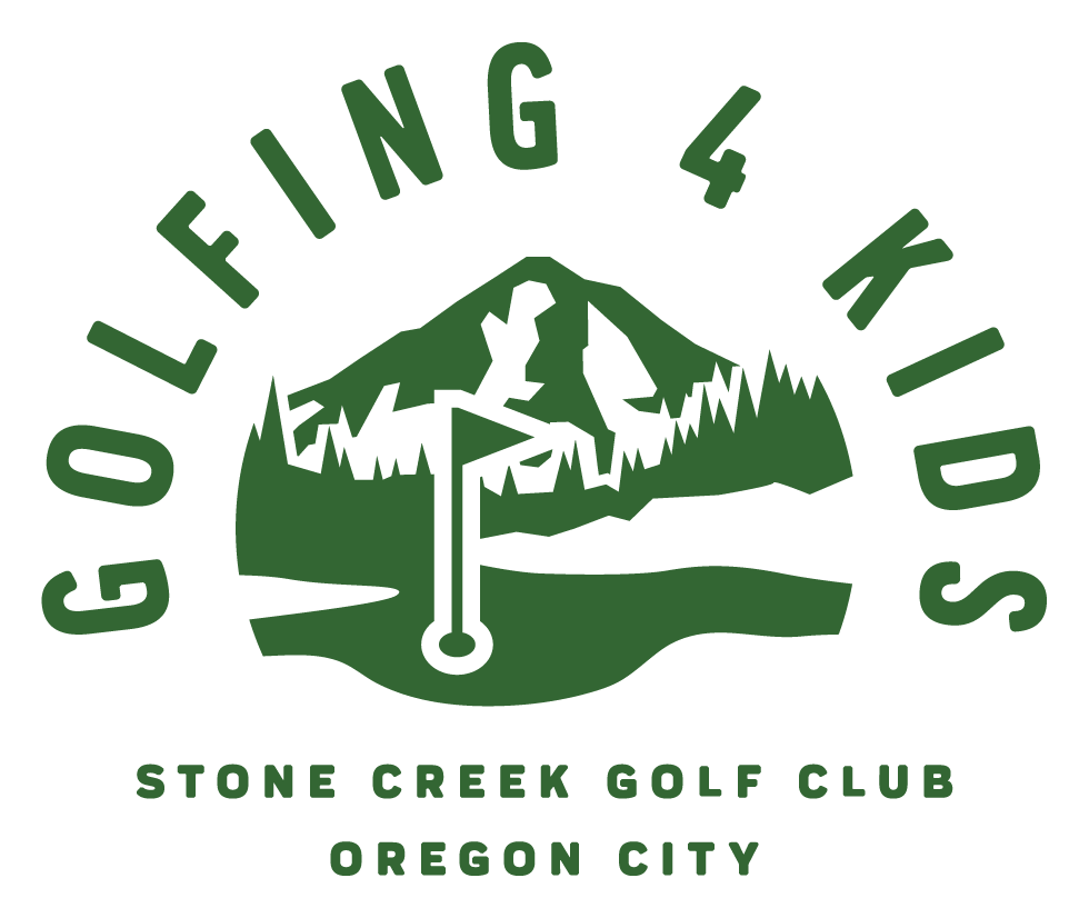
The client reached back out to adjust the name of the event to better align with their vision, and a new set of logos was created to match that.


This was a great side project that allowed me to grow my freelance abilities and work with clients directly. It’s great to see that the event continues today with some elements of the brand still in use.
-
Logo Design, Brand Book Design, Color Palette, Typography Suite.
-
mid 2019