
Peak Recovery: Identity
Developing a full brand package for a Portland based nonprofit that offers outdoor movement-based programming for people in mental health and substance use recovery.
Inspired by outdoor brands, the logo was intended to be bold and identifiable while remaining calm and approachable.
The goal was to create something that would be exciting, friendly, and rad to wear on a piece of clothing. The simplified box approach was a nod to the building blocks of treatment, symbolizing the solid base to start the path towards recovery. Losing the crossbar in the ‘A’ worked as both an arrow pointing up towards sobriety as well as an abstract mountain.


The color palette was inspired by both the vibrant hues seen on outerwear as well as the cool tones of the mountain peaks. Using a colder primary palette gave the brand an approachable yet energetic personality.
The red accent color was added as a way to highlight specific pieces like a safety beacon or signal.


To tie the brand together we developed a set of patterns and illustrations that continued to play up the outdoors.
The pattern is an abstract take on a wind forecast map using the logo ‘A’ as the directional arrow, while the Illustrations are a simplified take on a trail map with topographic lines and dotted paths. Together these helped elevate the brand giving them more opportunity to communicate the outdoor programming while remaining secondary to the messaging and photography.


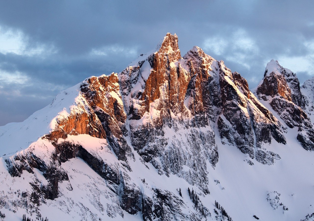
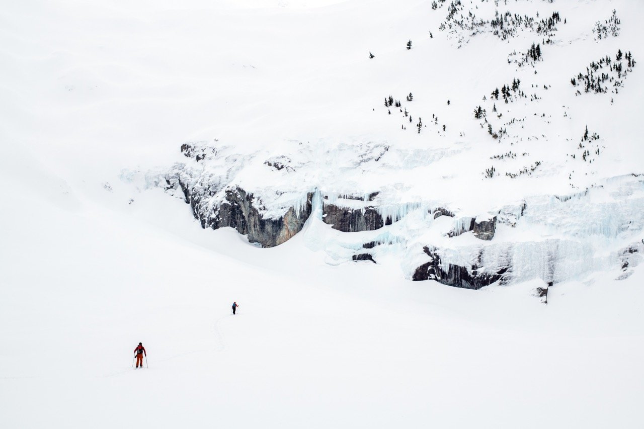
The super talented photographer Jason Hummel, captured some amazing shots of the extreme recreation and exploration these groups do at Peak Recovery. Seeing the photography helped to steer the brand to a place where it could work well with photography like this while staying legible.


The brand comes to life with large stylized headline typography mixed with blocks of color and stunning imagery.
This flexible system allows for elements to be dialed up or down based on what's being communicated. Which gave Peak Recovery the ability to speak to each of its audiences confidently and clearly.


Post brand delivery, we were approached again to help the team design their website.
Built through squarespace the site was easy enough to apply the brand exactly as intended. All of the brand elements fit seamlessly and worked well to communicate various layers of information. Once all the styles were set up and the pages looking great Peak Recovery was ready to launch into the community.
The founders were really awesome to work with and their energy helped fuel the brand to a place everyone was excited about. Plus seeing the success of the brand as it continues to grow and gain support is super rewarding.
-
Logo Design, Brand Book Design, Color Palette, Typography Suite, Website Styling
-
Late 2022 With Plastic Sunshine
-
Louis Carlton: Art Director